The Washington Chorus
Reimagining DC’s Most Dynamic Choral Ensemble
Challenge
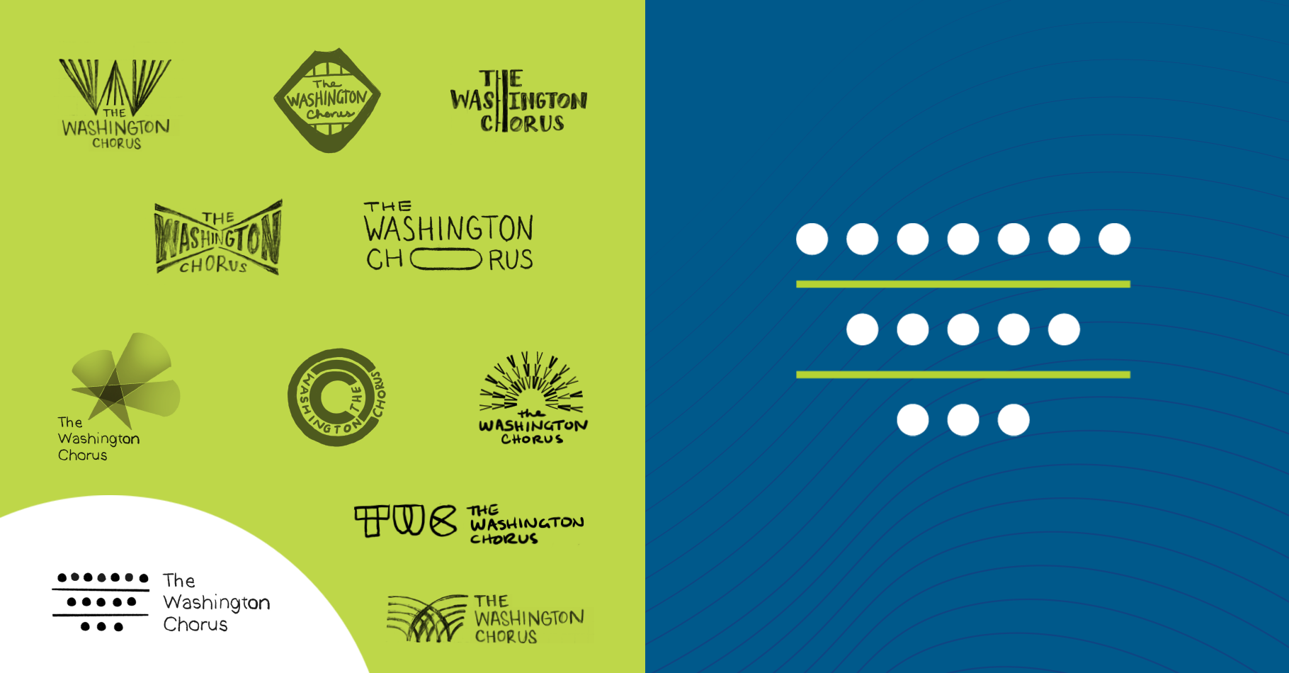
The Washington Chorus is one of the nation’s leading symphonic choruses, celebrated for its bold programming, Grammy-winning performances, and commitment to building community through music. Over several seasons of collaborating on concert posters and album design, we had gotten to know TWC’s vision up close. So when it came time to reimagine the chorus’ brand identity, we were happy to help bring that vision to life. The existing logo was intended to be a temporary placeholder while a name change occurred, but it remained in use for many years. The voice of the chorus was strong, but a cohesive identity eluded it.
Approach
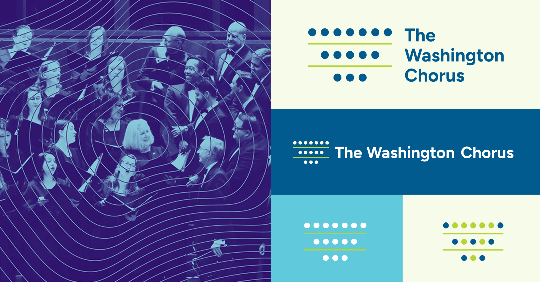
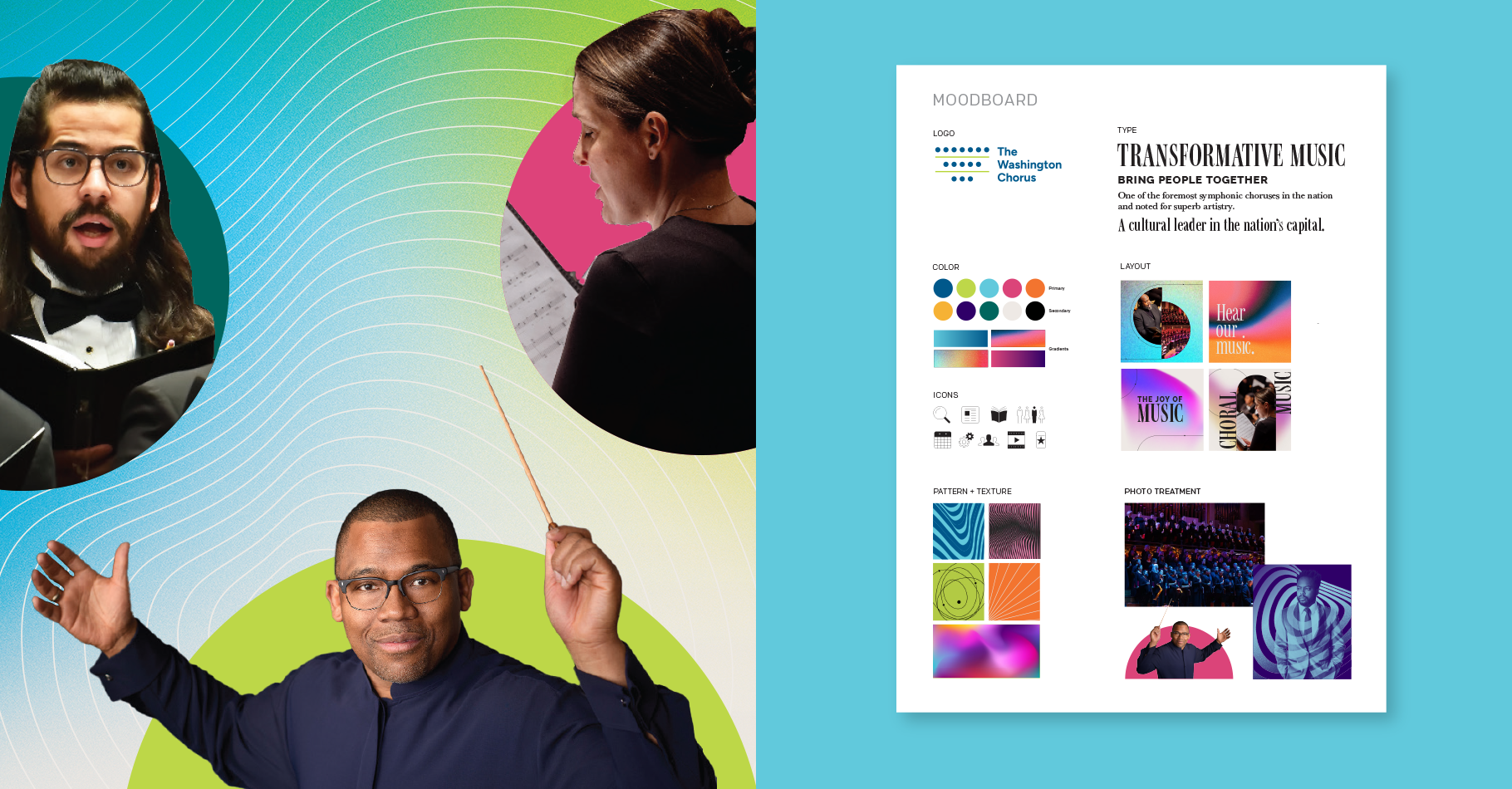
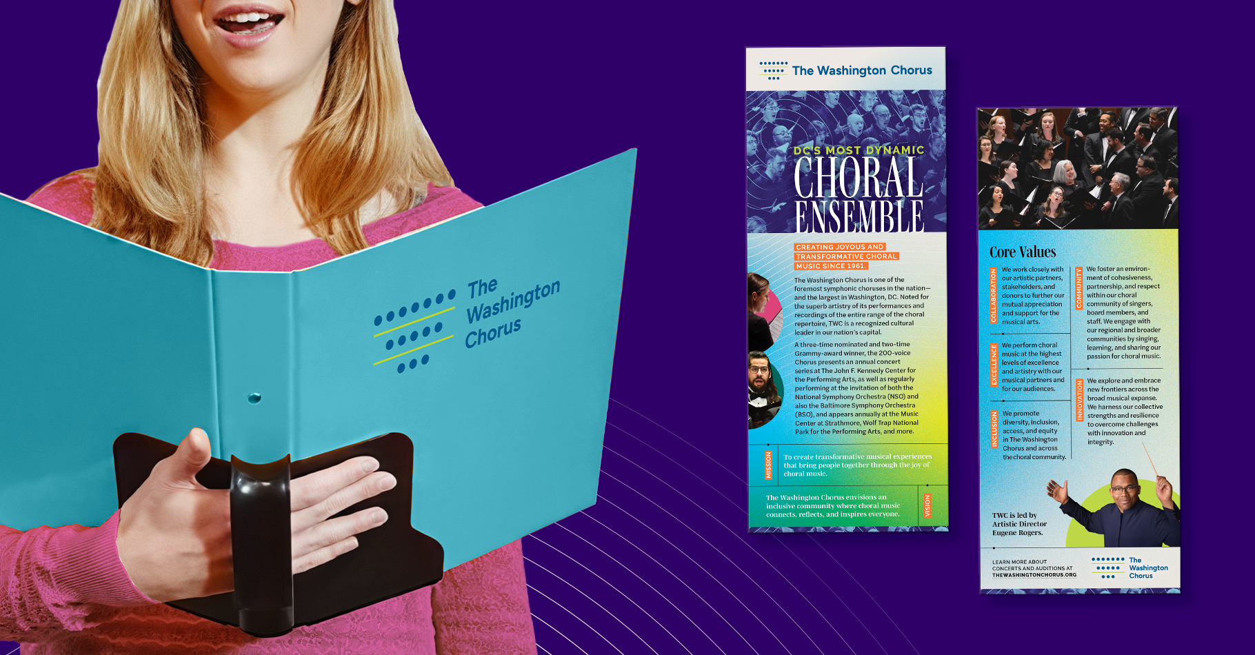
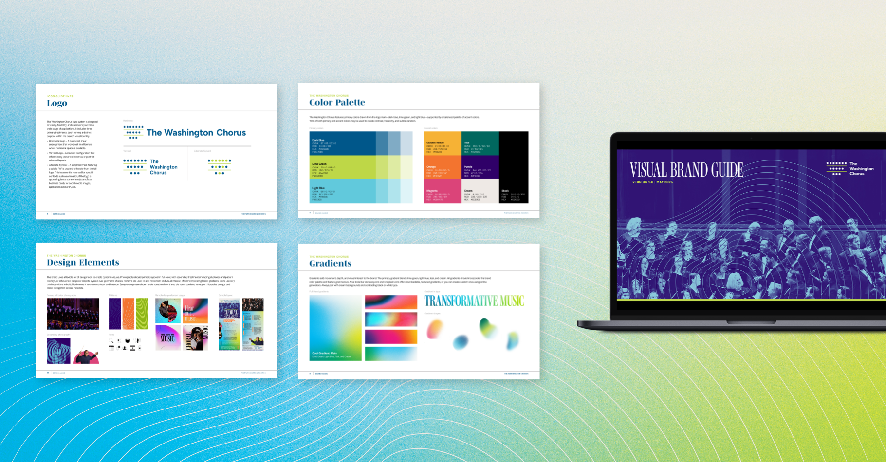
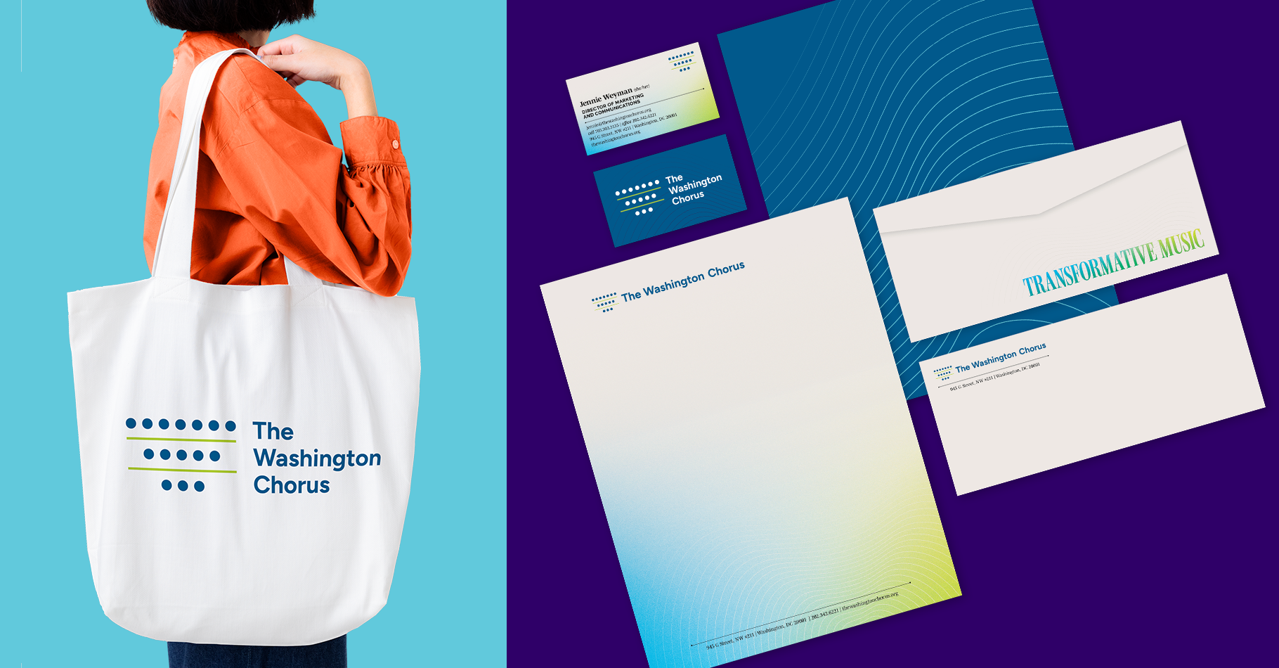
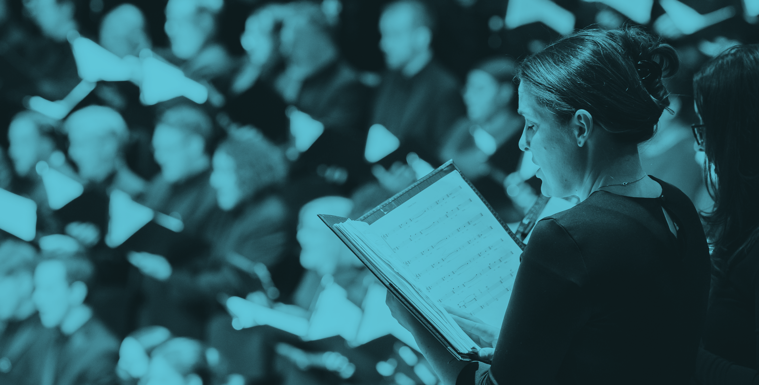
After conducting a landscape analysis and discussing the organization’s mission and vision with trustees, chorus members, and staff, we began by creating a new logo for TWC. The new mark is composed of abstract dots and lines that represent chorus members on risers and the rhythm of musical notation, subtly forming a “W.” Bold, energetic, and sophisticated colors reflect TWC’s vibrancy, artistry, and forward momentum. Building on the logo’s abstract and modern design, the visual identity uses radiating organic forms to evoke sound and energy. Textured gradients add depth and color. Tone-on-tone photography, layered with pattern overlays, creates a sense of growth and community, while clipped portraits highlight the individual artists and the vibrant personalities behind the music.