American Historical Association
A Fresh Perspective
Challenge
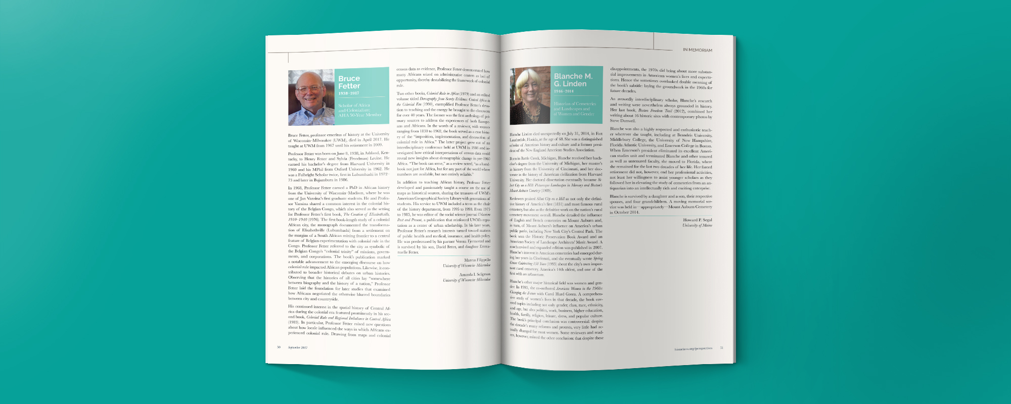
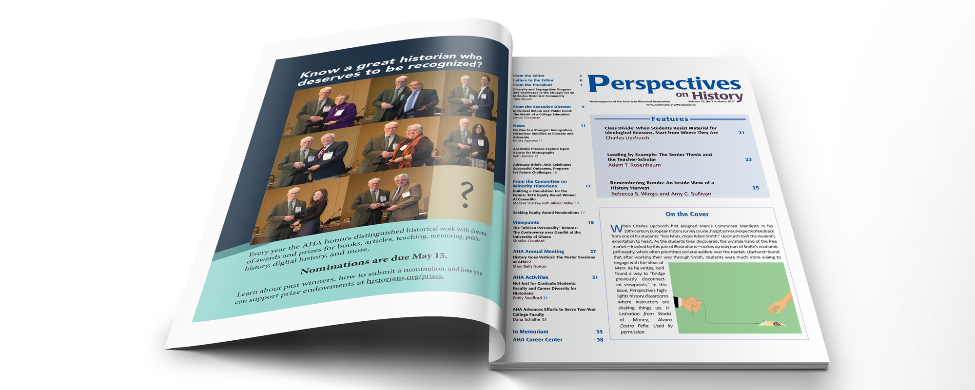
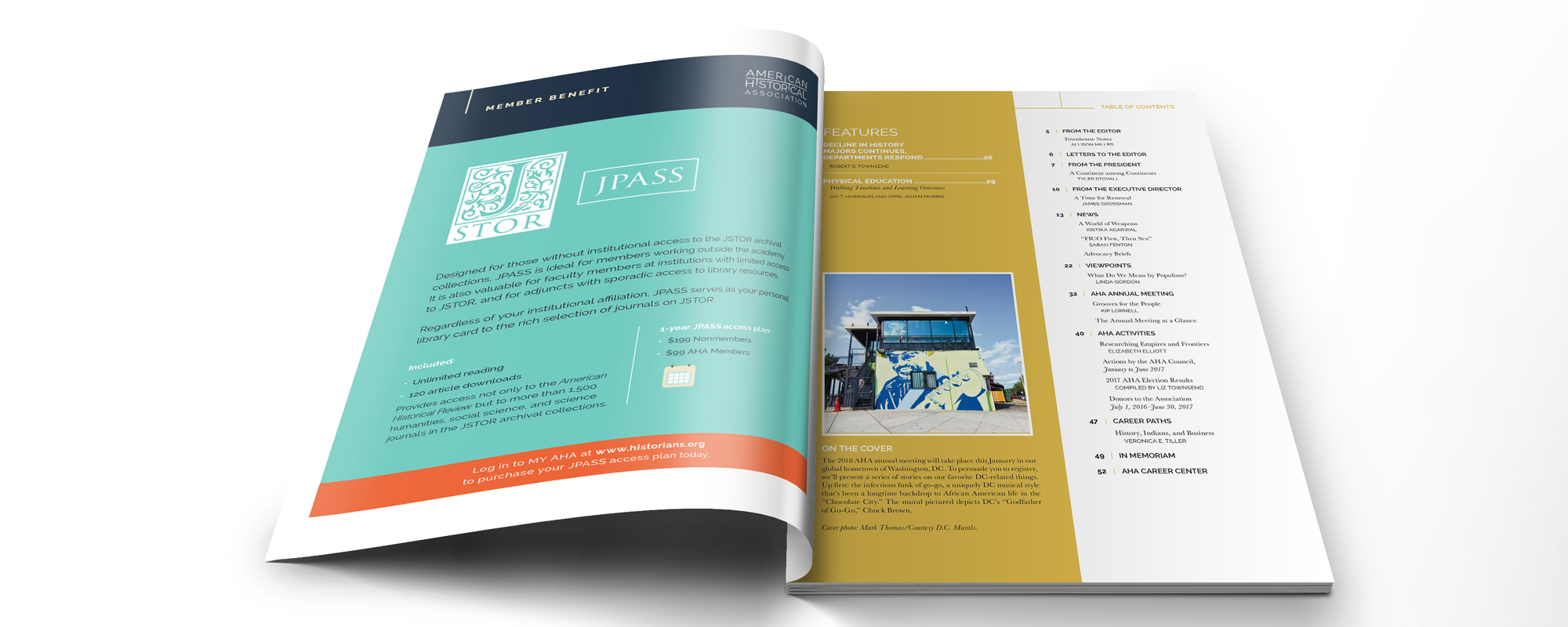
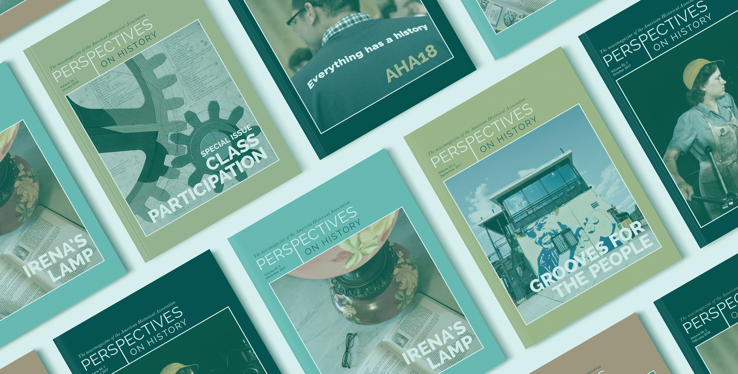
As a follow-up to working with the American Historical Association (AHA) to rebrand their organization (including their logo, website, and other brand collateral), we were asked to design a new template for this scholarly society’s magazine, Perspectives on History. The publication, which has been published monthly during the academic year (9 times per year) for 50 years, also needed an updated, newly branded look and feel. The magazine redesign needed to fit into the larger AHA suite of assets and materials that we had just updated the prior year, that would be suitable for its 15,000+ readership within the history discipline.
Approach
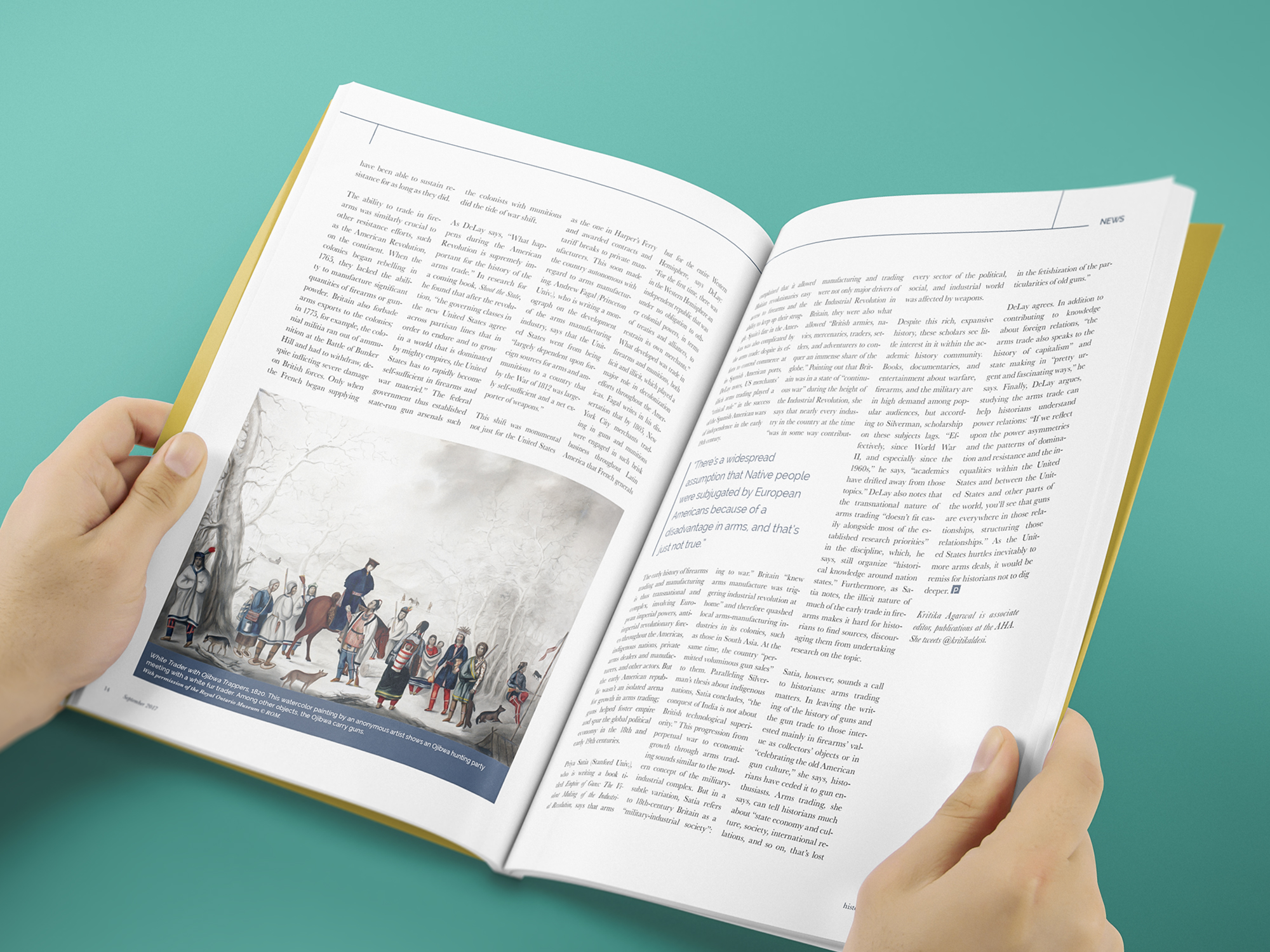
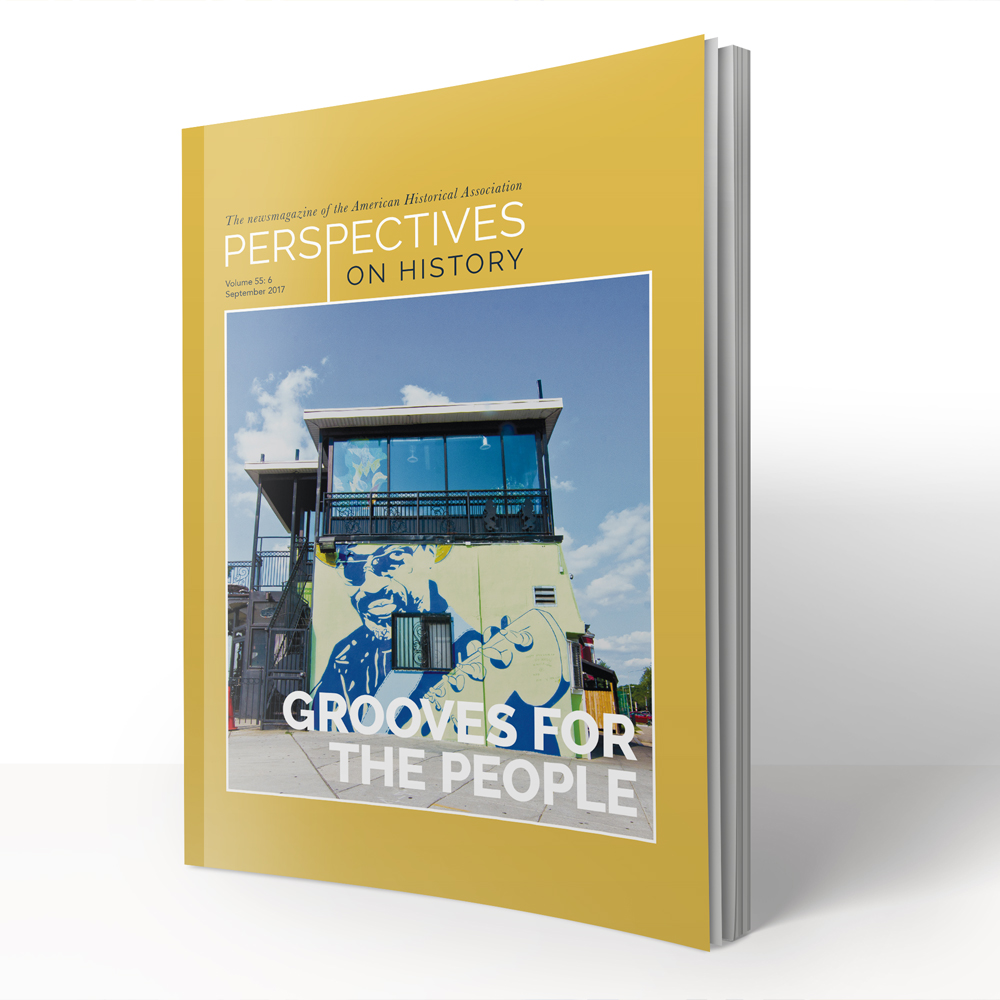
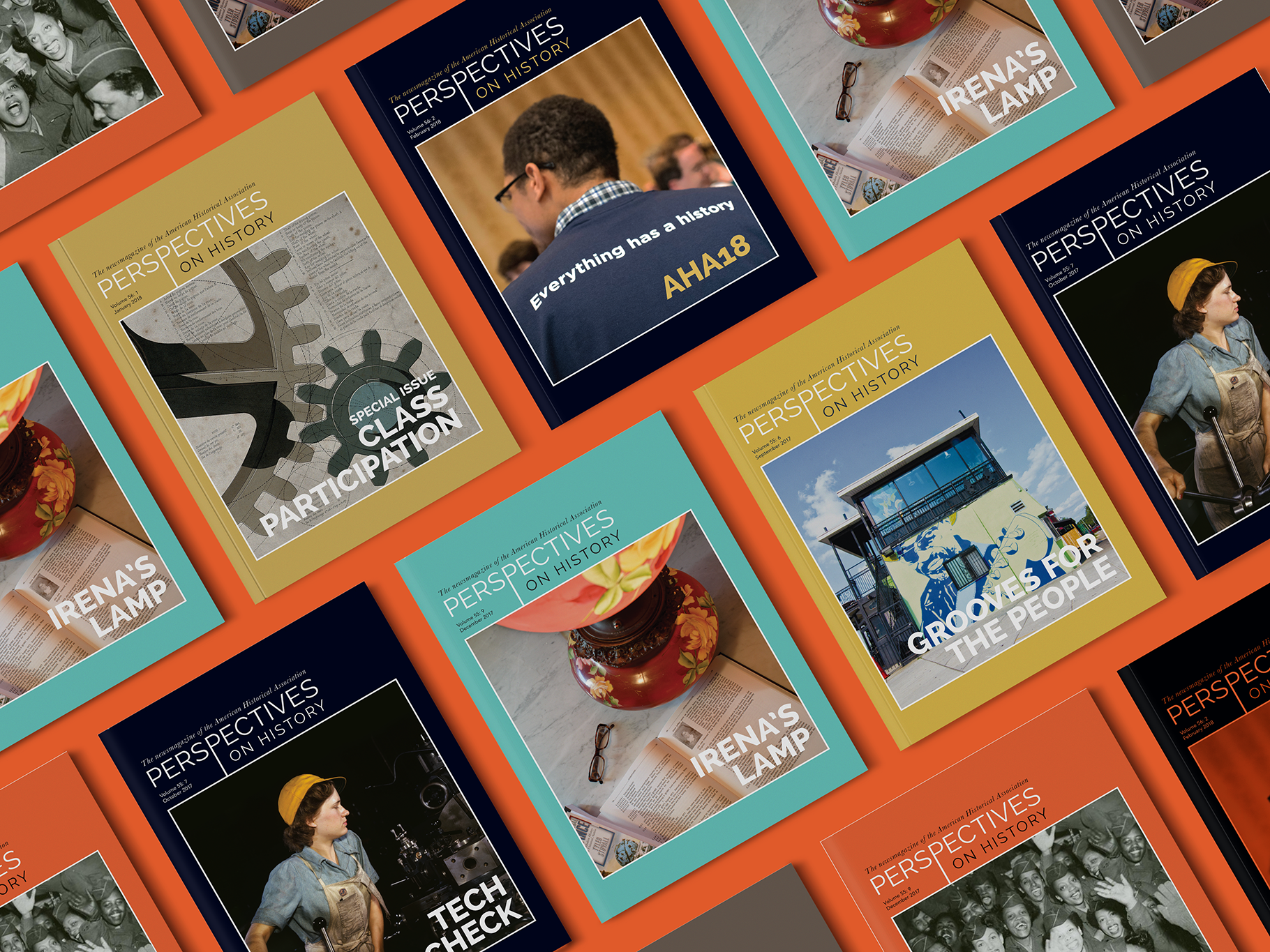
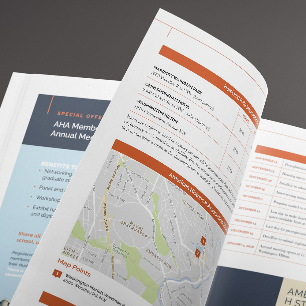
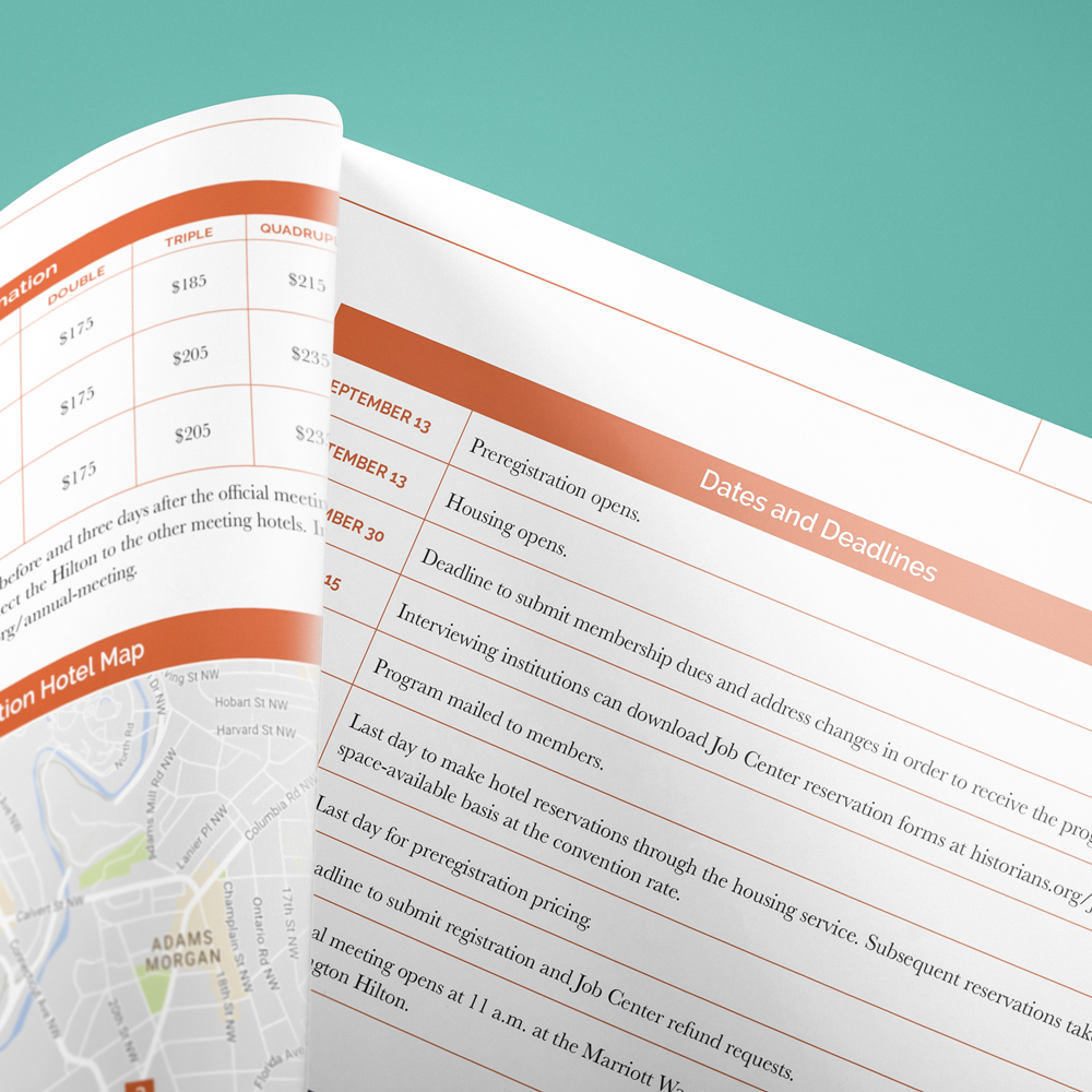
Due to the heavy emphasis on words in this history magazine, our design template emphasizes typography and the strategic use of icons and supplemental graphics to support the rich content within. A specific color scheme guides readers through each section of the publication, and thoughtfully-placed white space, clean lines, and a grid layout lends a polished, professional, and modern look to this decades-old magazine, enticing both long-time AHA readers and new members alike.
