Food Bank of the Rockies
Igniting Community to Nourish People
Challenge
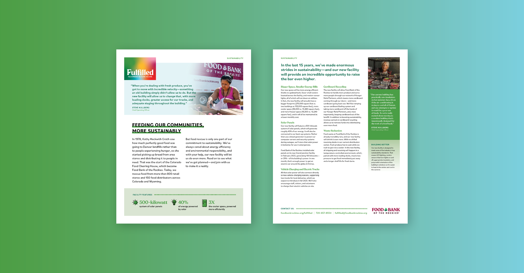
Food Bank of the Rockies serves communities across Colorado and Wyoming—the largest food bank coverage area in the contiguous United States. After 17 years in the same building, the organization has long outgrown its space. While a new facility won't end hunger, it will help the Food Bank of the Rockies store, organize, prepare, distribute, and feed more people. Eighty2degrees was brought on board to develop a name, identity, and brand system for a capital campaign to raise funding for the new 270,000-square-foot building.
Approach
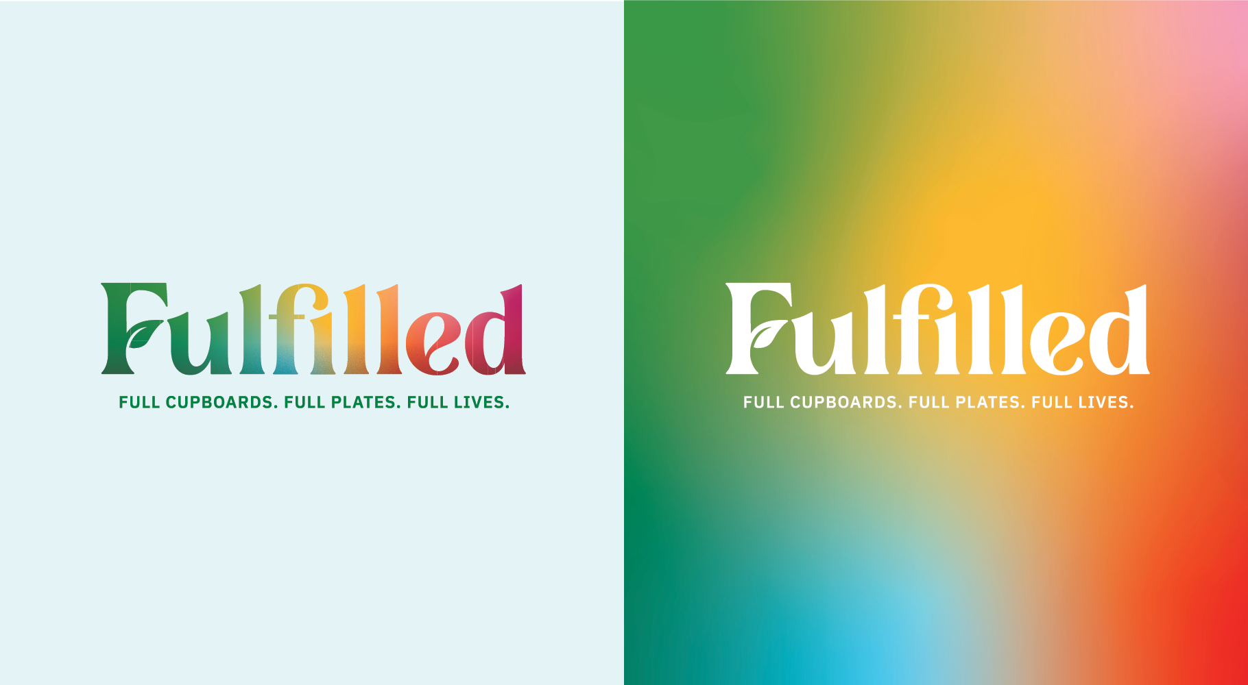
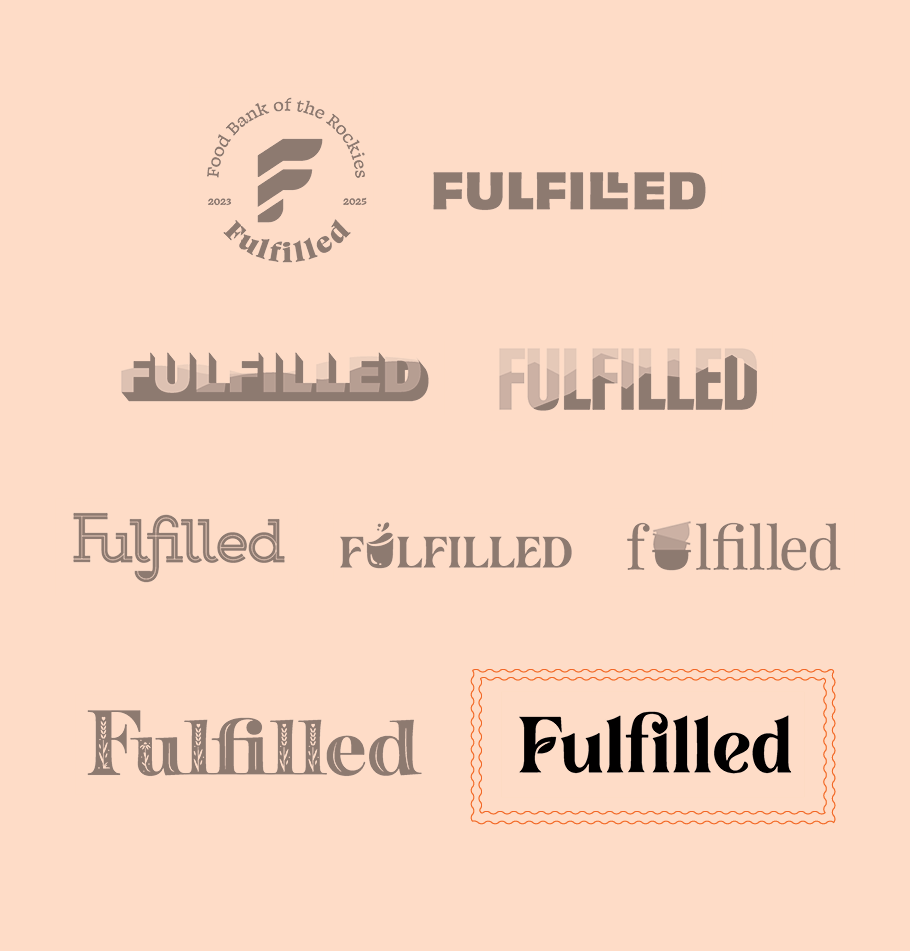
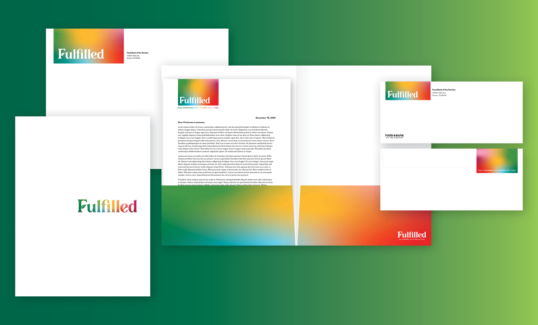
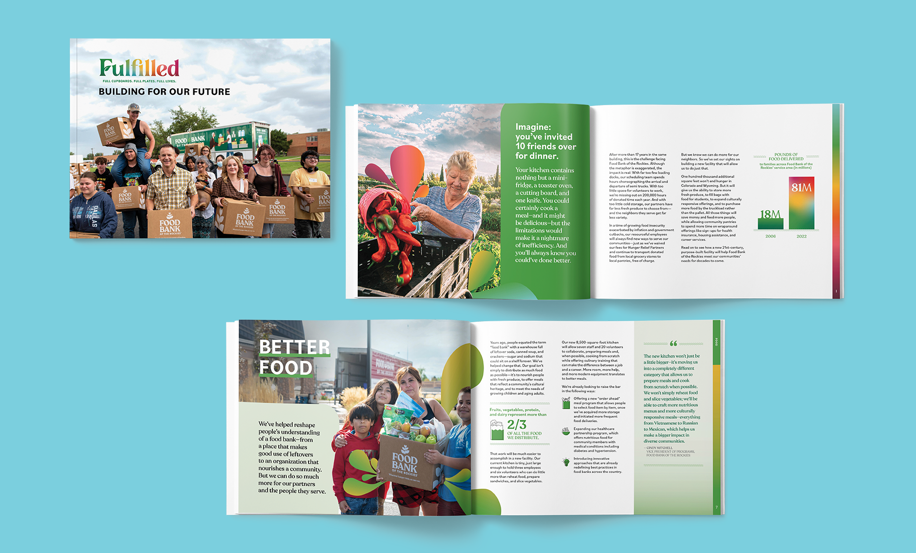
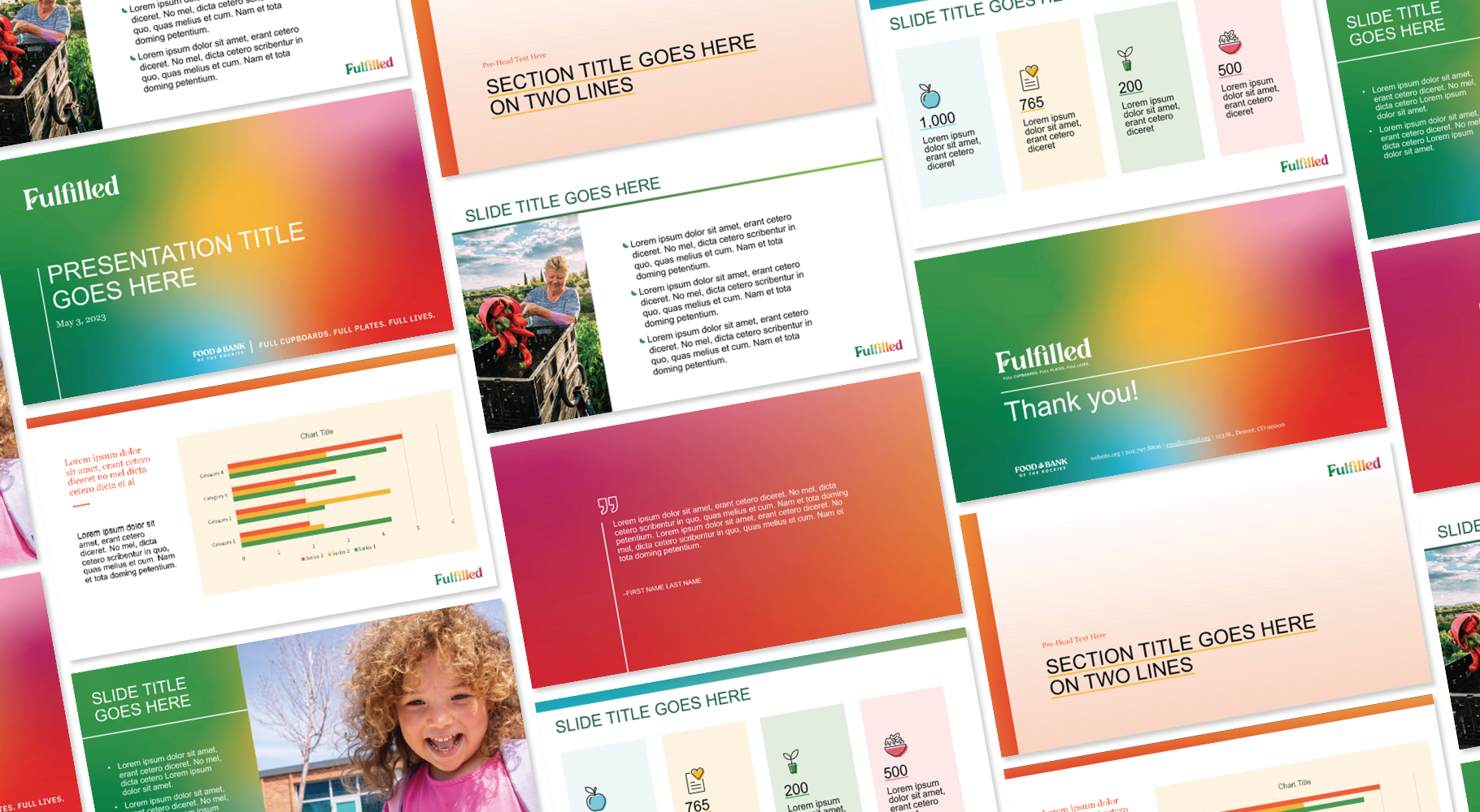
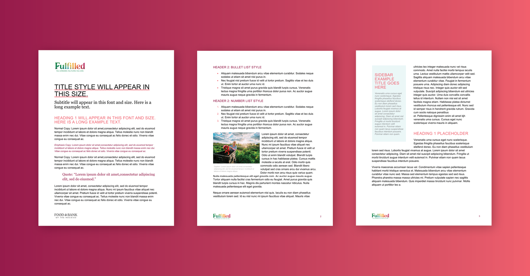
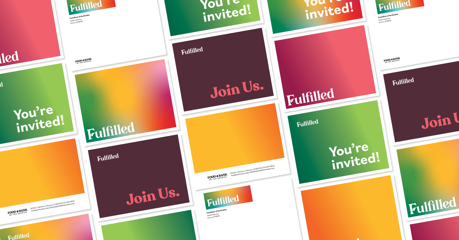
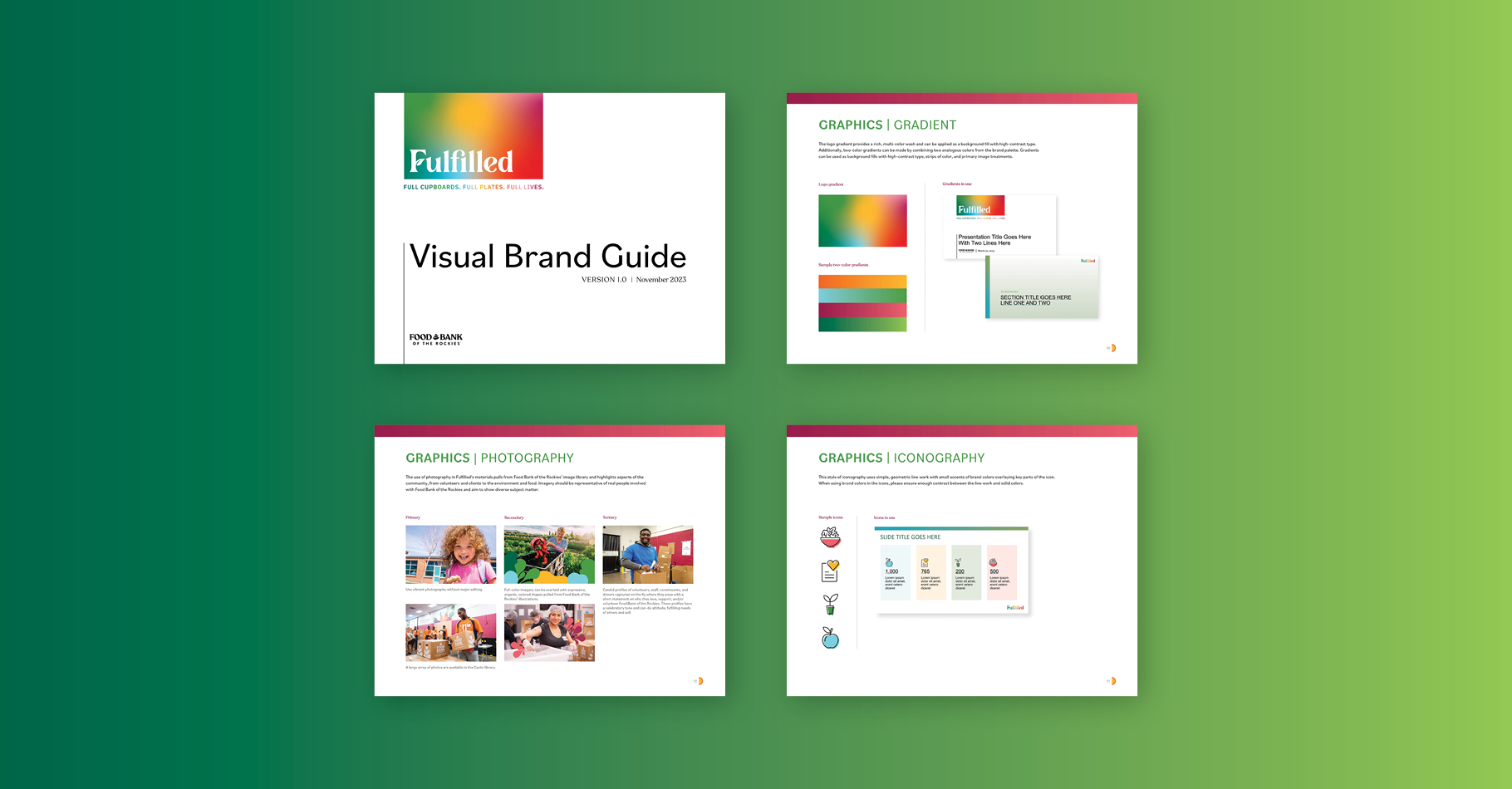
To encapsulate the spirit of the organization, we crafted a colorful typographic logo mark that conveys joy, health, growth, and community. The multi-color green-to-red gradient that fills the logo became a signature element for the brand. We created a campaign brand toolkit that captures the spirit of “we can do it” optimism, friendliness, and grassroots impact. The color palette, typography, and patterns are uplifting and celebratory. Full-color imagery emphasizing positivity and community is overlaid with expressive, organic, colored shapes inspired by the food bank’s main branding illustrations. Simple, geometric line-work style icons add a clean layer of detail to impactful statistics.
