American Historical Association
Bringing History Forward
Challenge
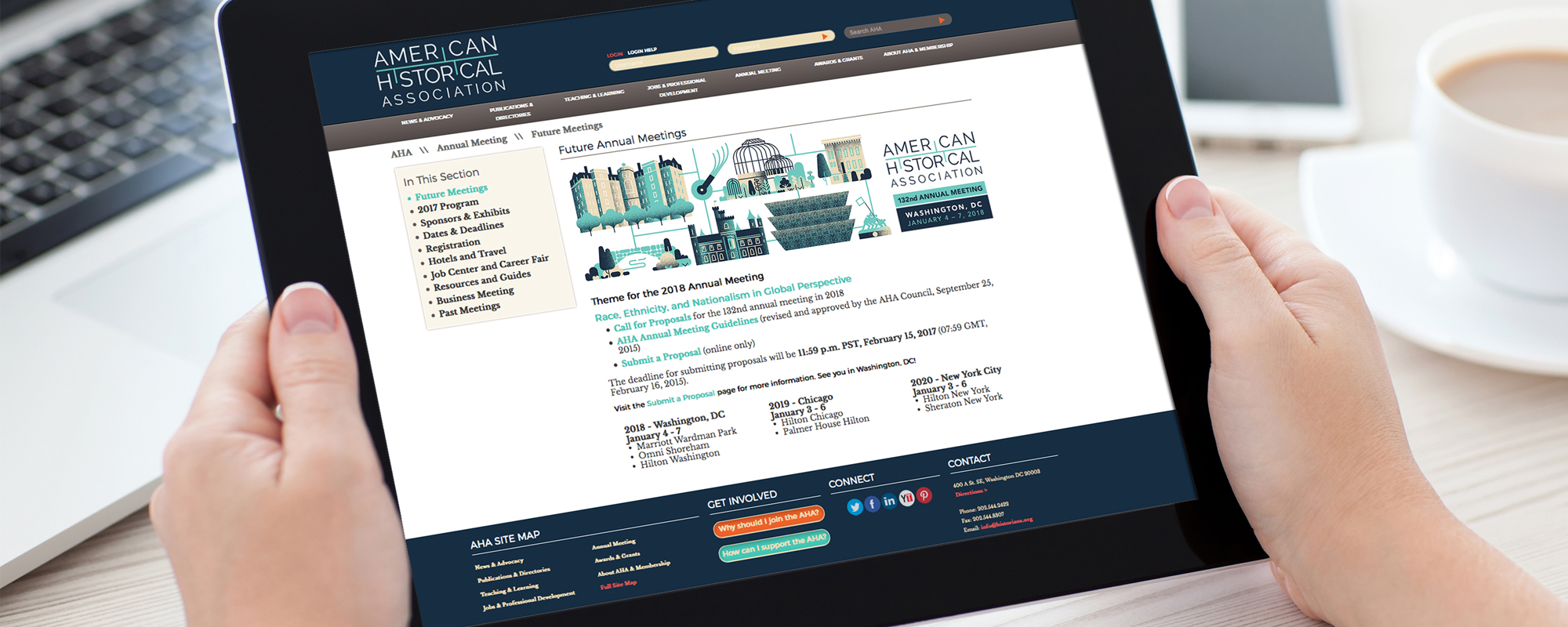
How do you keep history up-to-date? The American Historical Association (AHA) approached us with this challenge when they were in need of organizational rebranding. The historians and scholars that formed their membership base desired a more modern aesthetic that could be implemented easily throughout print and digital media.
Approach
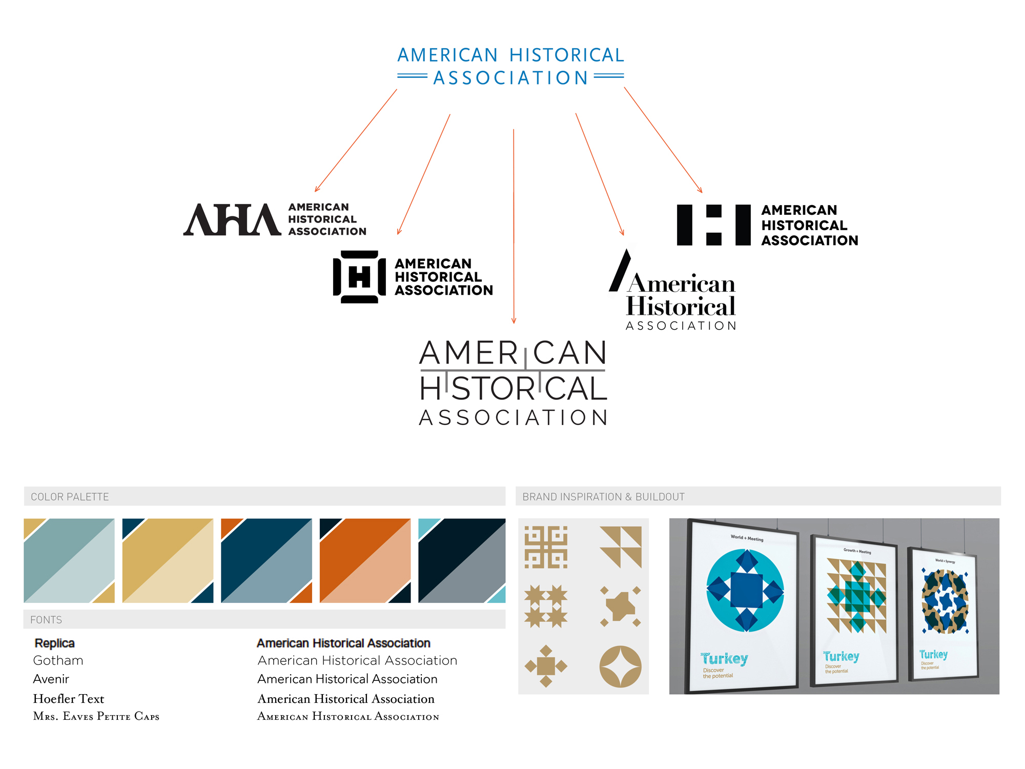
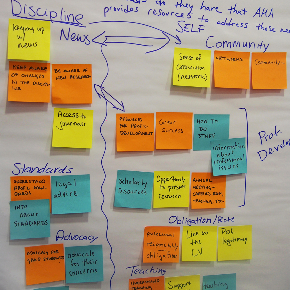
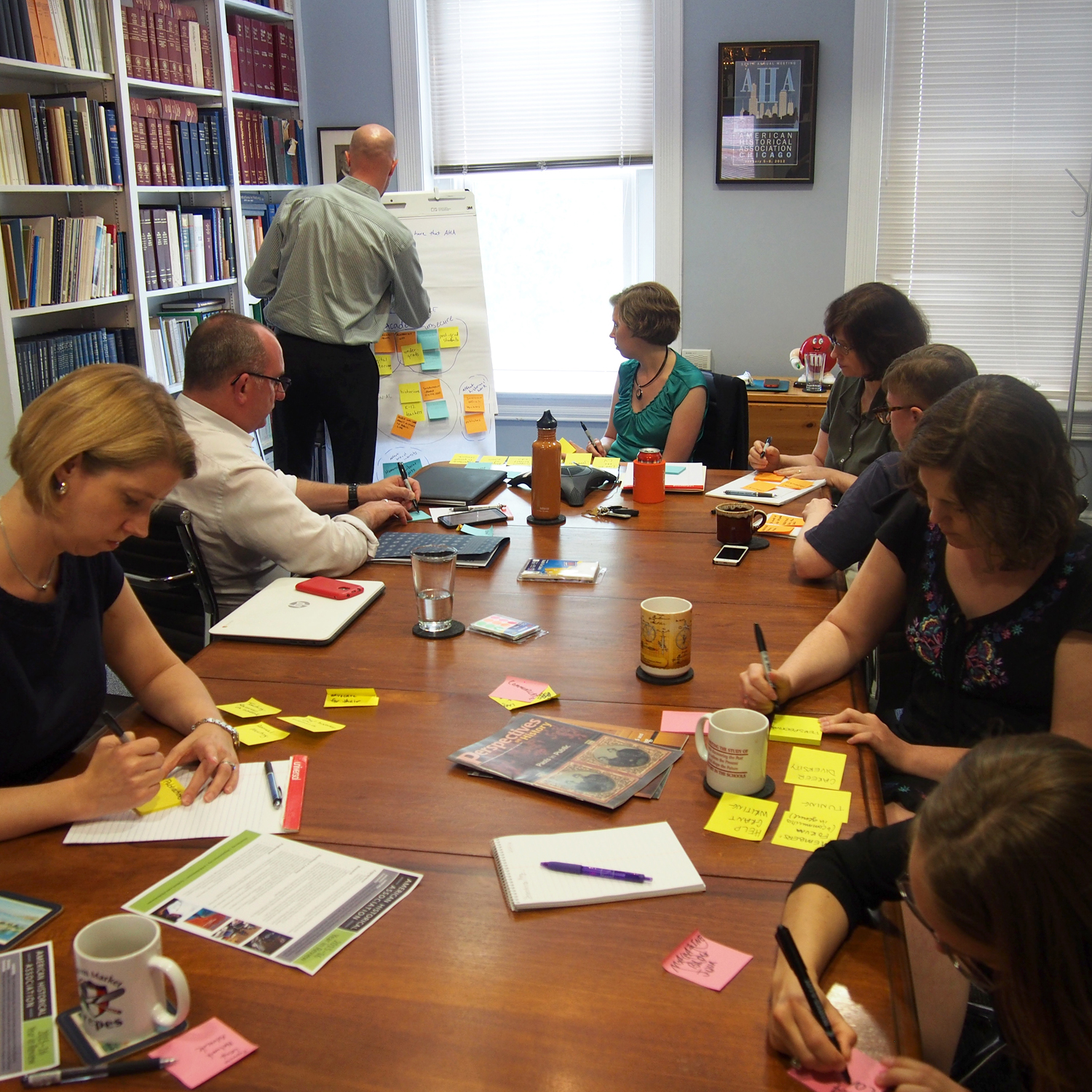
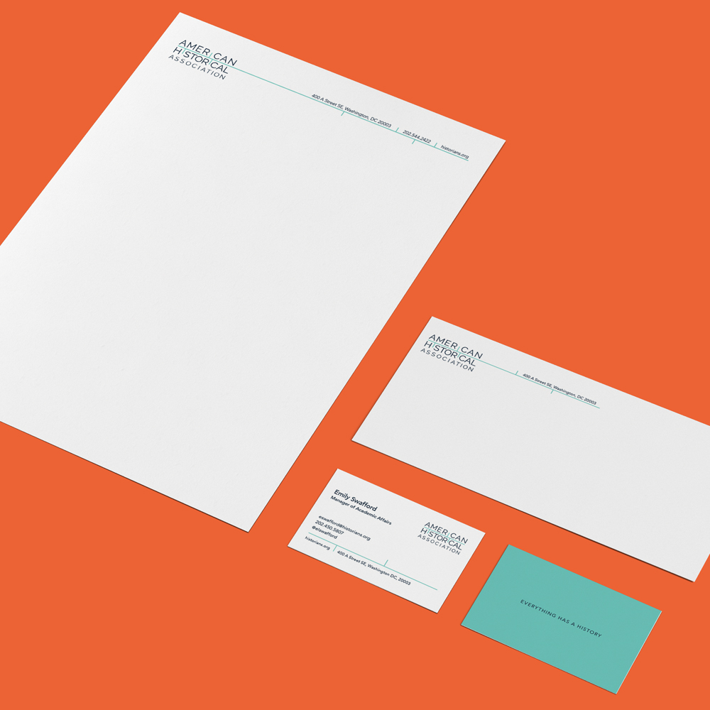
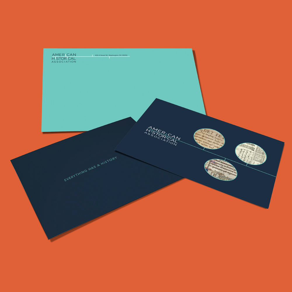
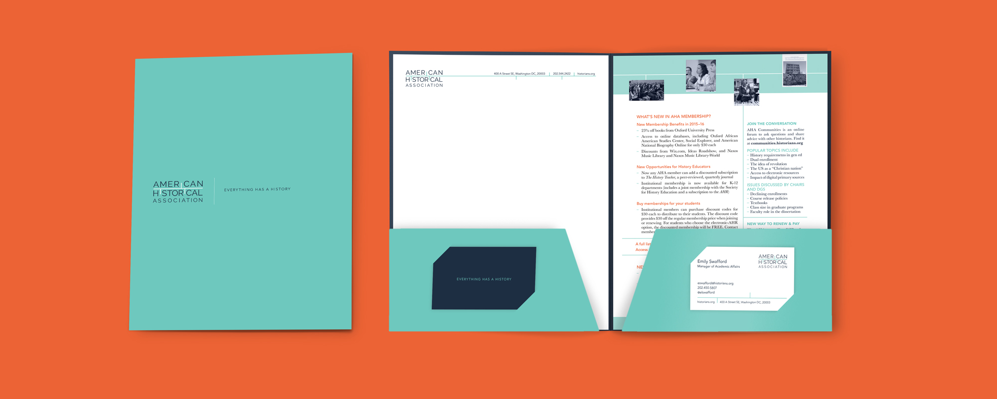
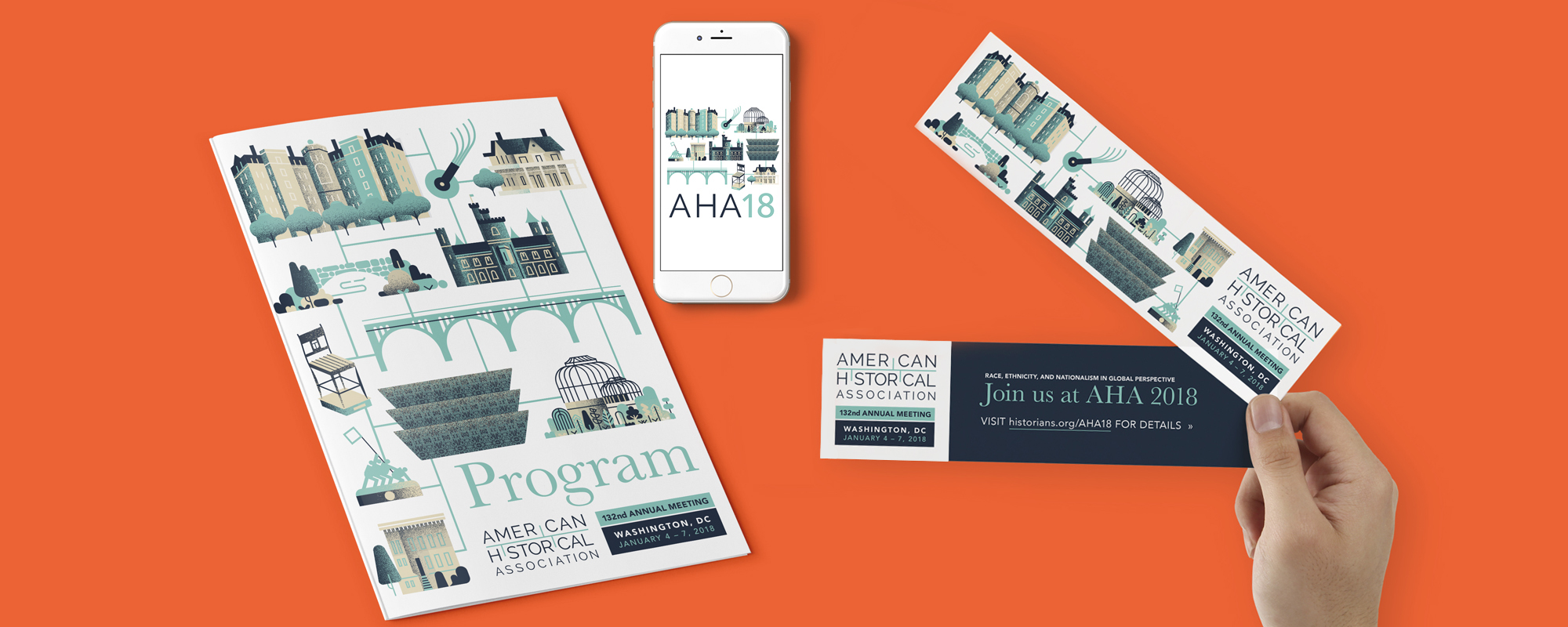
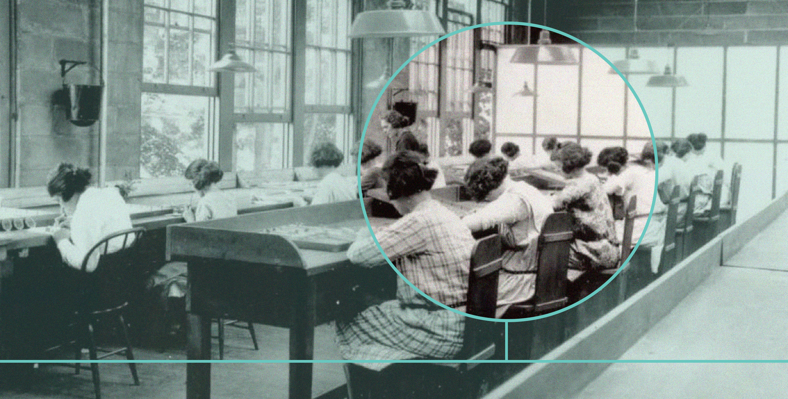
Through a series of design thinking workshops, we helped AHA's team hone in on a set of core values, which then guided the creative direction. We built their new look around a simple timeline that echoes the past, present, and future. The cool, modern palette breaks away from the cliched sepia tones that is usually associated with old artifacts. As part of AHA's new branded collateral, we created custom illustrations for their major annual event.
