Smithsonian's National Zoo
Branding for the Birds
Challenge
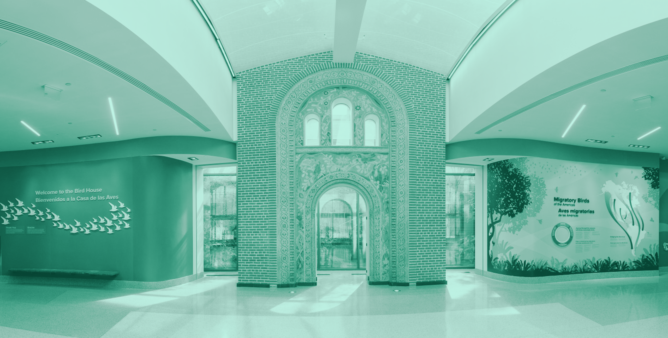
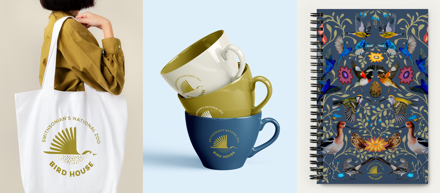
After an extensive transformation, the Smithsonian's National Zoo's Bird House has just reopened to visitors! Included in that transformation of the building is a new logo by Eighty2degrees. The zoo asked us to develop a new, exciting visual identity for the bird house that would excite the general public about birds so they understand why they are essential to the environment. They also wanted a logo that was flexible to use across the zoo and on various materials.
Approach
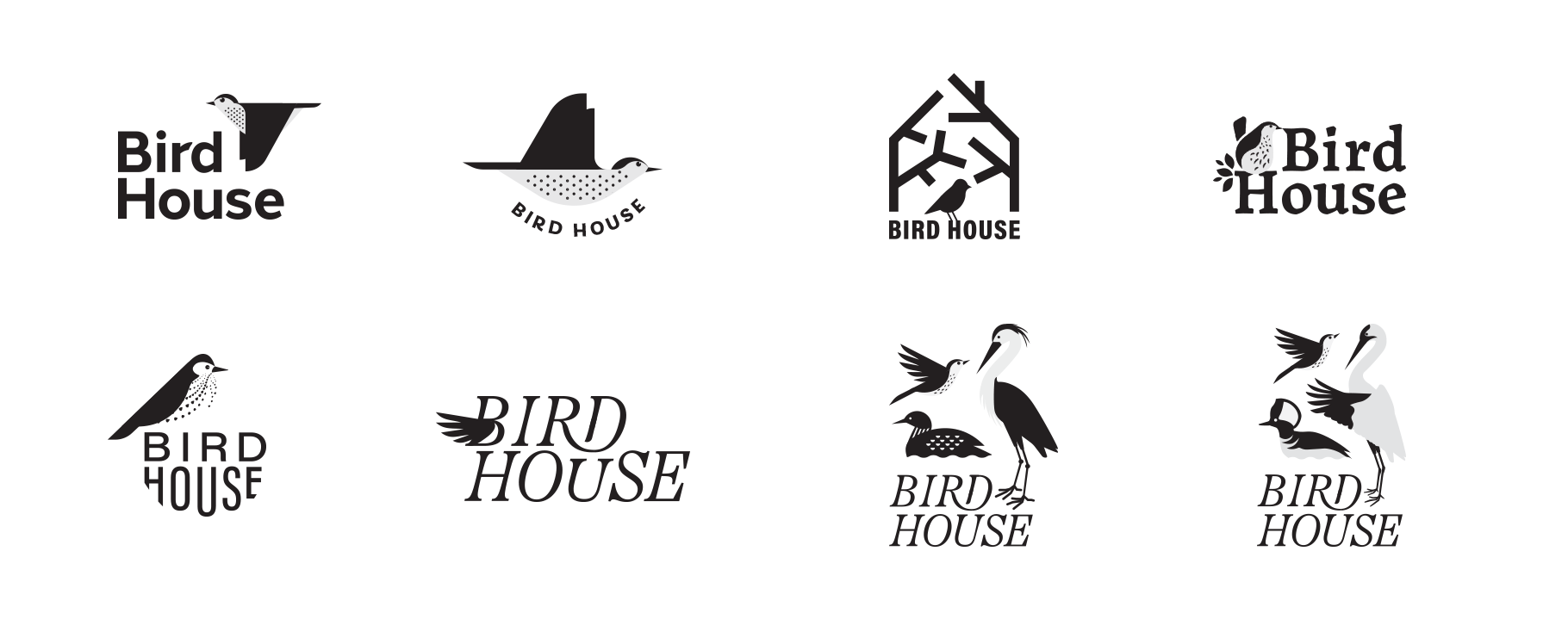
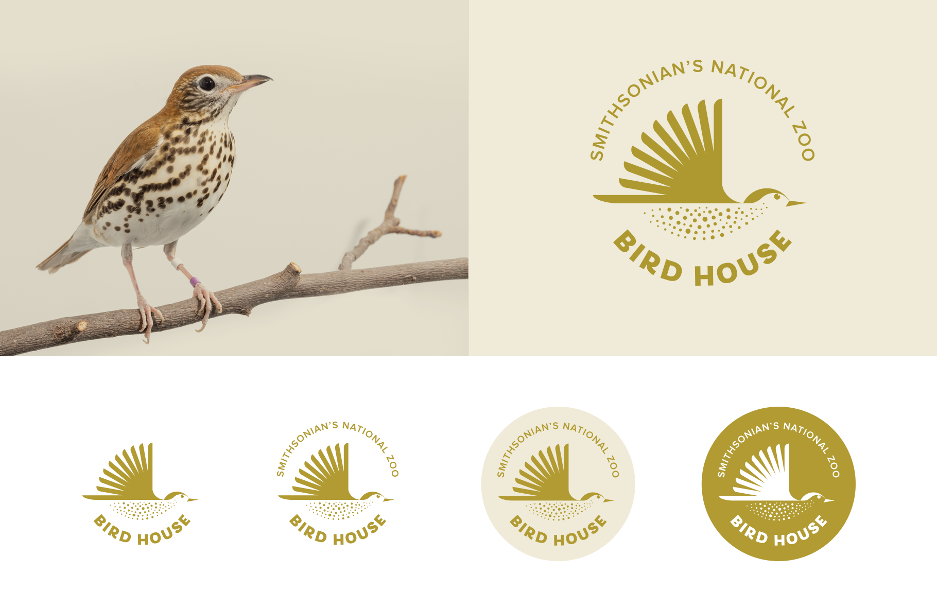
We designed a stylized, geometric bird mid-flight. Its wing and the surrounding curved typography add a sense of movement to the mark. The belly of the bird is formed with various-sized dots resembling feather markings. After exploring numerous color options, we selected a bright, warm, golden color, not unlike the coloring of Washington DC's official bird, the wood thrush.


