Counterpart International
Building Inclusive, Sustainable Communities
Challenge
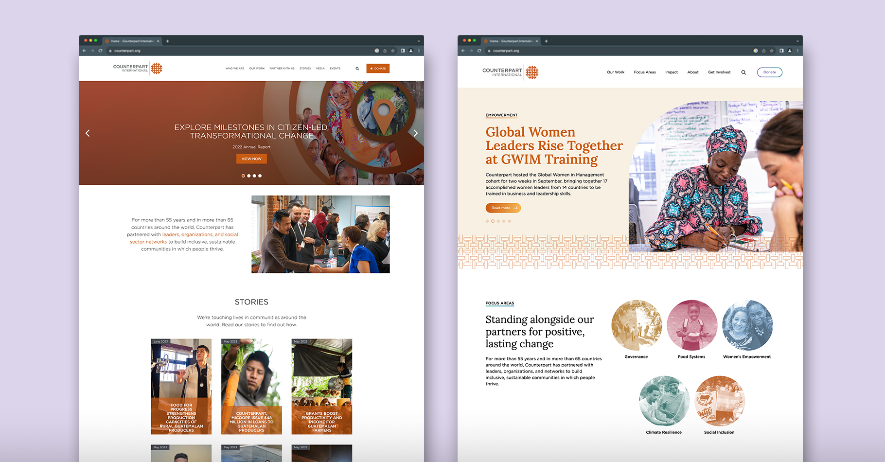
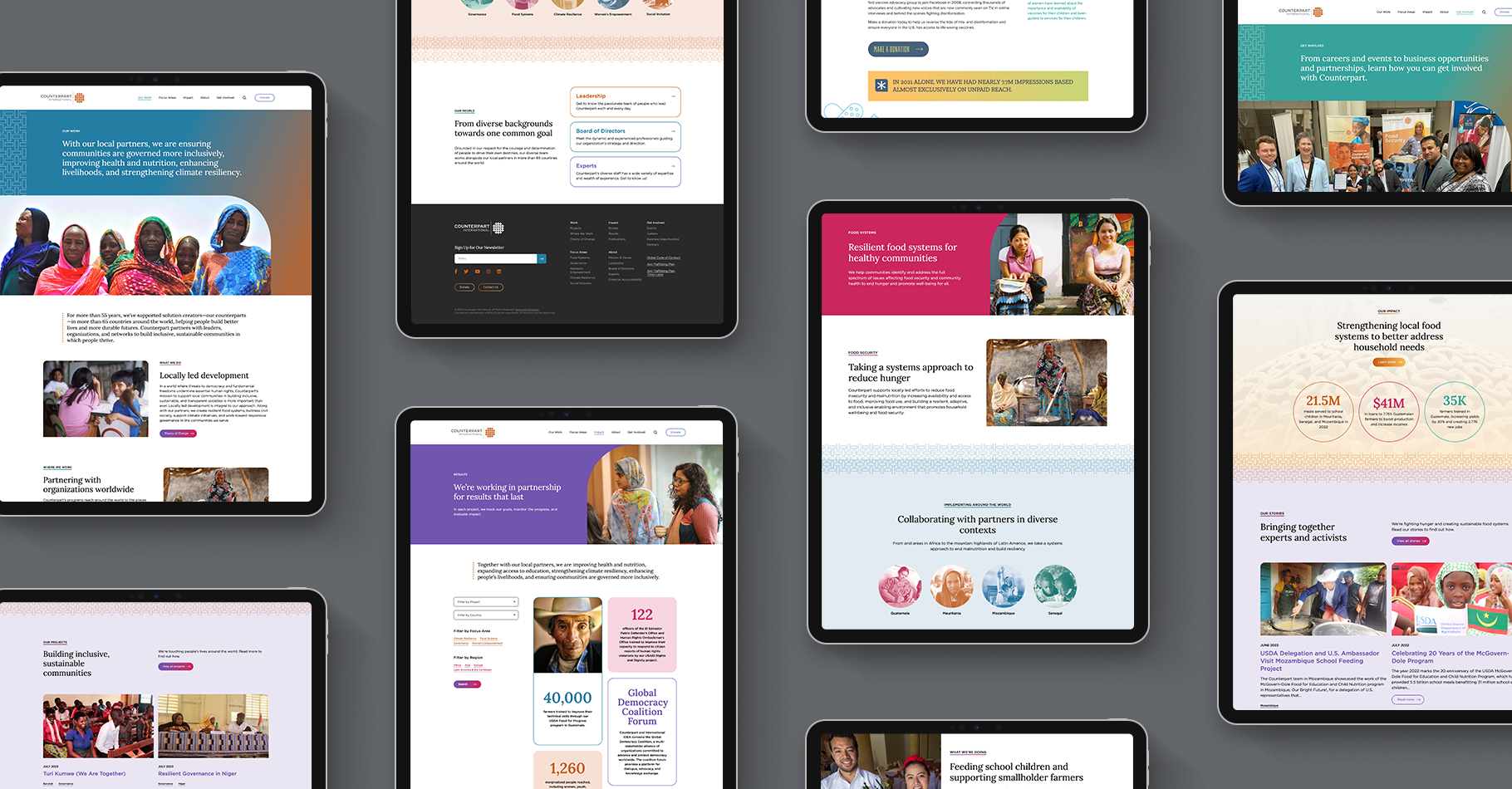
The desire for a complete overhaul of its website led Counterpart International to Eighty2degrees. To successfully share the organization’s mission to support local communities in building inclusive, sustainable, and transparent societies, Counterpart needed a better organized, easier-to-navigate, and understandable website. The breadth and depth of the organization’s programming were not being conveyed. The site's visual experience was not telling the organization's brand story well, and technically, the site was hard to use, update, and integrate with external services.
Approach
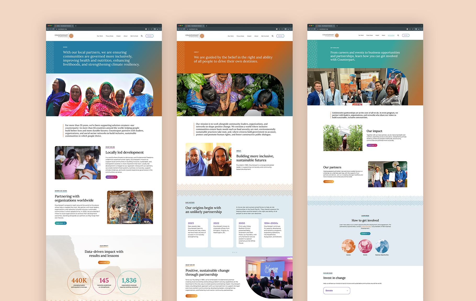
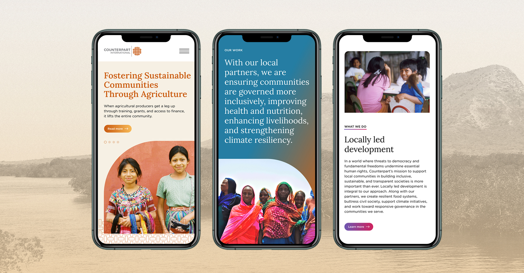
We helped Counterpart restructure the site from the ground up. With the new site architecture we created, we organized Counterpart’s areas of expertise and what they do into distinct categories so that those areas have a stronger presence on the site. Using their library of images, we told the organization’s visual story in a brighter and bolder manner. We improved the implementation of its brand across the site by expanding the color palette and type styles. We added a serif typeface to the mix to augment the professionalism of the brand. We introduced gradients and the basketweave pattern from its logo as textural elements. Our development partners at Lightning Fruit built this site in WordPress with a modular design system for easy updating by Counterpart's internal team.
