The Outlaw Report
Sleek New Site
Challenge
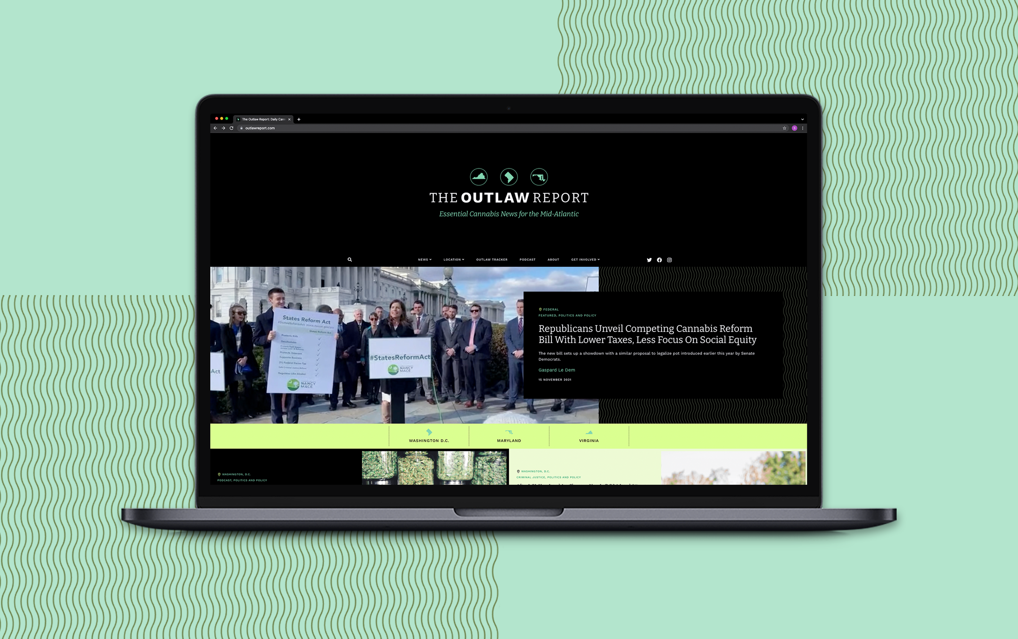
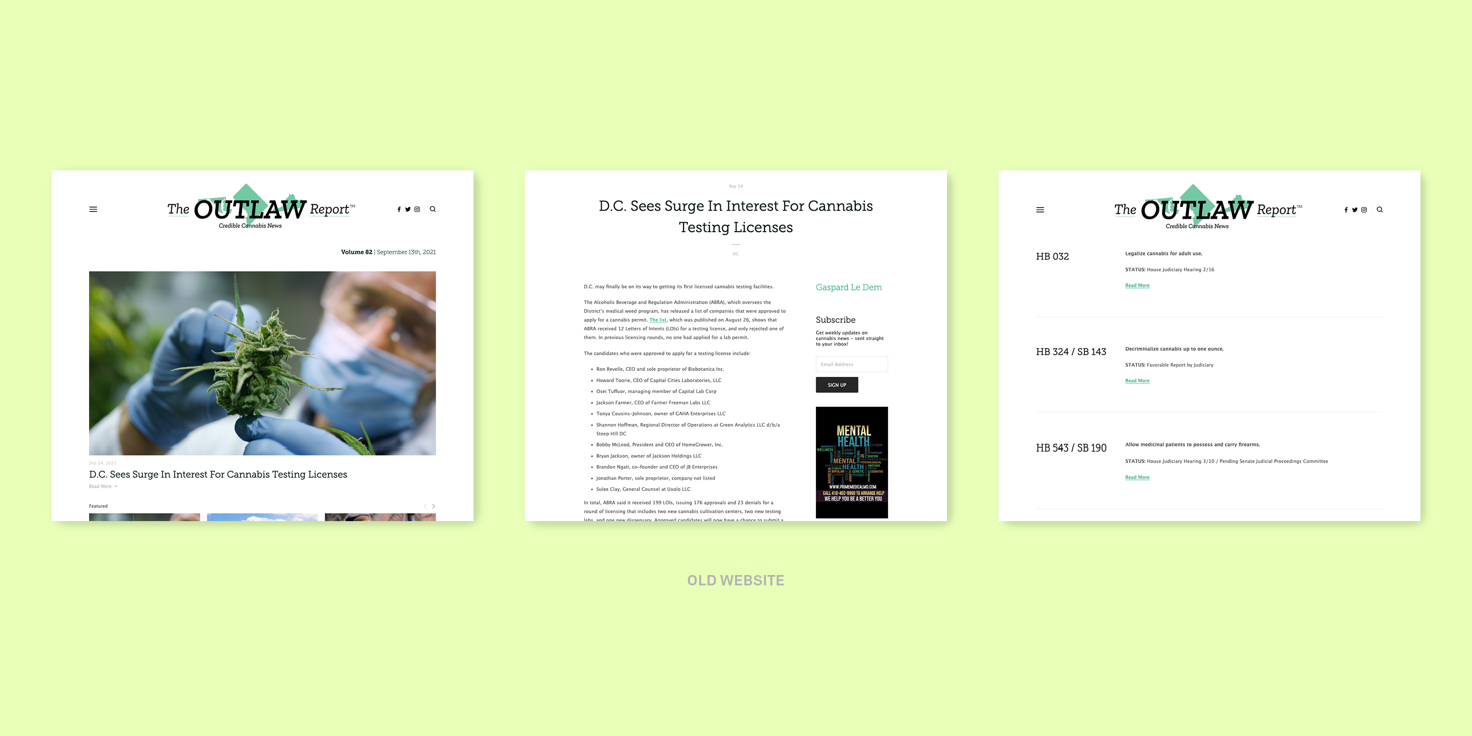
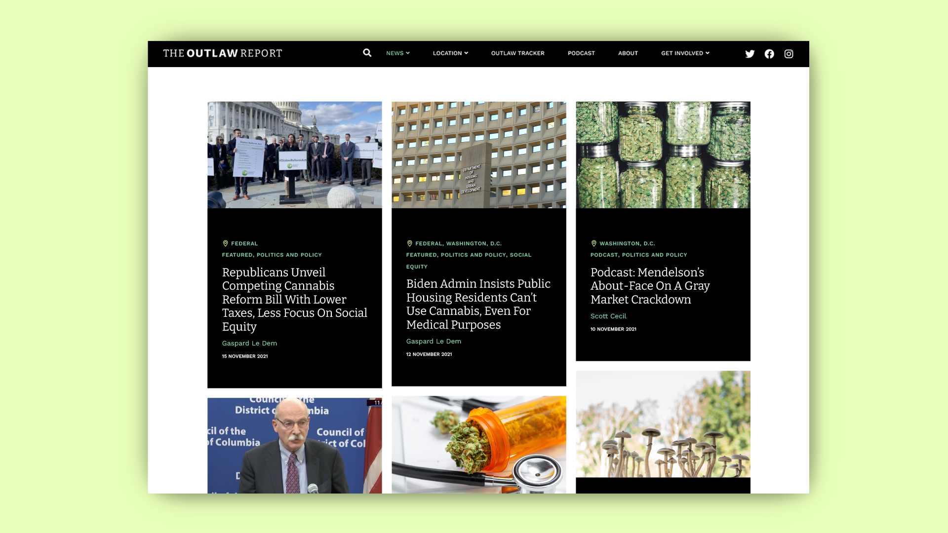
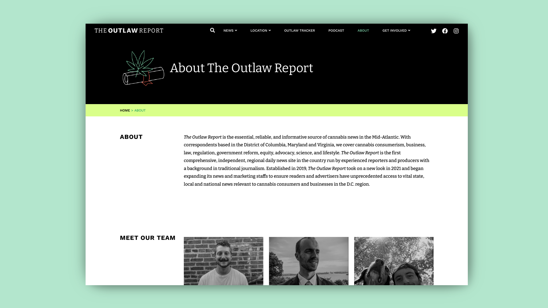
The Outlaw Report, an independent source for cannabis news in DC, Maryland, and Virginia, needed an updated website. Their existing site had begun to feel stale. They were seeking an updated, more distinctive look that would appeal to their core audiences and capture the current energy and momentum around their issues. Their logo also needed a refresh in order to integrate successfully into their new site and function well on-screen, in print, and on merchandise.
Approach
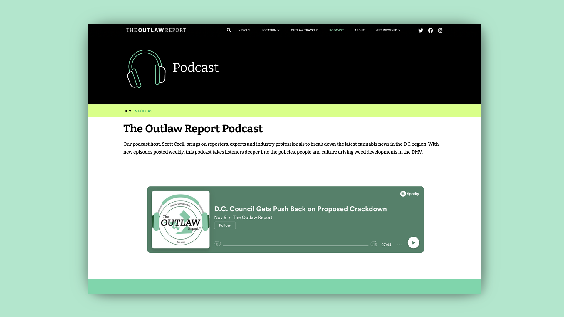
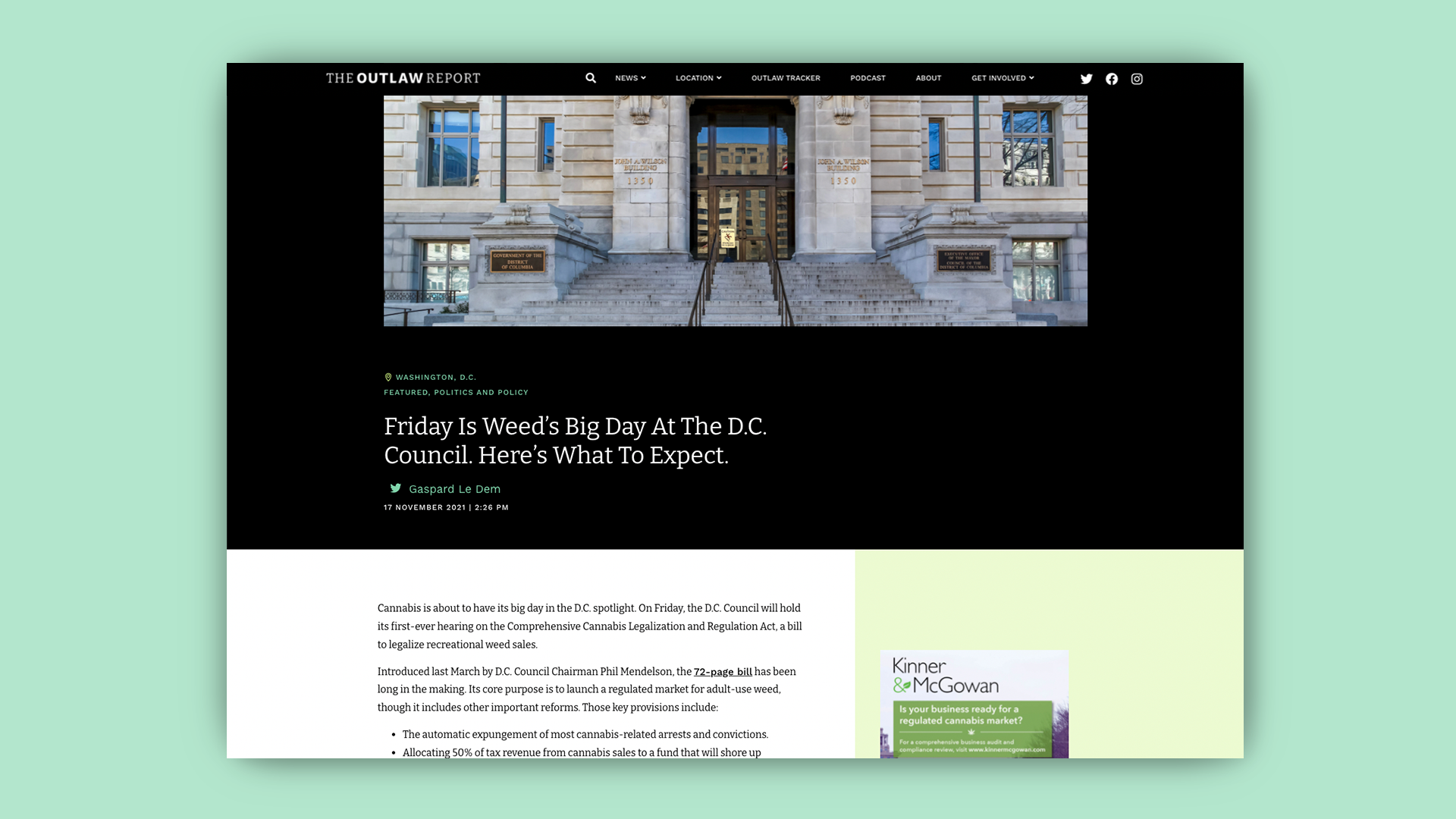
We created a fresh new look for the Outlaw Report, beginning with a logo that felt cleaner, simpler, and more modern. We studied peer news outlets, and designed a new visual direction for the Outlaw Report’s website that felt sleek, professional, and unexpected enough to stand out among their peer sites. A stark black and white palette with touches of vivid color and an updated approach to typography make the site feel bold and contemporary. A custom-drawn set of icons establish a graphic style for the brand, and embody the Outlaw Report’s unique voice.
